开发 Vue Uploads 桌面端上传组件
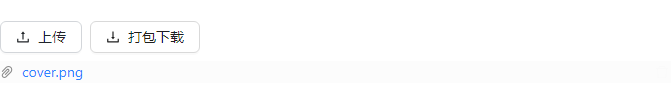
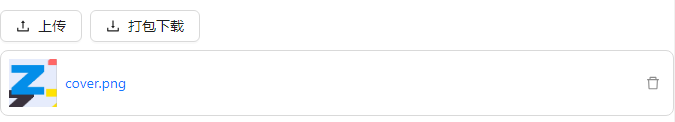
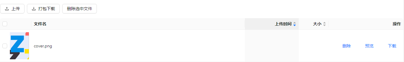
通过使用 Uploads 上传组件,实现文件上传,也可以使用上传组件的打包下载功能打包下载上传的文件。

设计思路
使用平台基于 Ant-Design-Vue Upload 组件进行二次封装的 Upload 组件,来实现 Uploads 上传组件核心逻辑,基于自定义默认插槽来增加“打包下载”按钮。给“上传”按钮之外的 dom 设置阻止事件冒泡,来取消“打开文件选择对话框”行为,设置“打包下载”按钮的下载逻辑。使用 css 设置上传组件中的上传区域在图片墙模式下的样式。
使用方法如下
let {showBatchDownload, class: className, ...others} = props;
others.class = className + " ant-uploads ";
let {...vSlots} = slots;
let uploadProps = use.getProps("Upload", "upload", {});
if (showBatchDownload) {
if (uploadProps.listType == "picture-card") {
    vSlots.default = () => <div disabled={props.disabled} class={"ant-upload-list-item ant-upload-more-icon"}
                                onClick={handleClick}>
    <div class={"ant-upload-list-item-actions"}>
        <Space>
        <UploadOutlined class={"ant-upload-flag"}/>
        <DownloadOutlined onClick={handleDownload}/>
        </Space>
    </div>
    </div>;
} else {
    vSlots.default = () => <Space onClick={handleClick} class={"ant-upload-more"}>
    <Button class={"ant-upload-flag"}><UploadOutlined/>上传</Button>
    <Button onClick={handleDownload}><DownloadOutlined/>打包下载</Button>
    </Space>;
}
}
return <Upload listType="text"  {...attrs} {...uploadProps} {...others} vSlots={vSlots}></Upload>;
开发过程
新建组件
创建 vuepccomp 组件包,创建 Uploads 组件,注意大小写。创建组件功能参考《创建组件包和组件》。
配置组件名称、图标和模板
打开组件模板文件 UI2/comp/vuepccomp/components/Uploads/designer/Uploads.xml,如下所示
<element name="vuepccomp:Uploads"
             tag-name="Uploads"
             text="上传"
             icon="Uploads.png"
             discriminate-condition="executeXpath(name()='vuepccomp:Uploads')"
             component-type="layout-container"
             design-view="web-designer">
    <events>
        <include path="$UI/wxsys/comps/vueContainer/commonConfig.xml#//vue-events-pcx/*"/>
    </events>
    <templates>
        <template name="default">
            <![CDATA[
                <vuepccomp:Uploads xmlns:vuepccomp="$UI/comp/vuepccomp/components" >
                </vuepccomp:Uploads>
            ]]></template>
    </templates>
</element>
- element 中的 text 是组件名称
- element 中的 icon 是组件图标
- 图片文件位于 UI2/comp/vuepccomp/components/Uploads/designer/img/Uploads.png
- include 引用标准 W3C 事件,非组件事件。
- template 中的代码是组件模板
- 在页面添加组件后,模板是加在 w 文件中的代码
在组件面板中显示
打开组件面板配置文件 UI2/comp/vuepccomp/components/vuepccomp.components.xml,如下所示
<reg-info>
    <!-- 组件目录注册 -->
    <component-dirs framework="vue">Uploads</component-dirs>

    <!-- 组件工具箱配置 -->
    <toolbox>
    </toolbox>

    <!-- 兼容旧端工具箱配置 -->
    <quickide-toolbox>
    </quickide-toolbox>

    <!-- 傻瓜式ide工具栏配置 -->
    <uixide-toolbox framework="vue">
        <catalog name="定制" order="13">
            <item component-name="vuepccomp:Uploads" device="pcx"/>
        </catalog>
    </uixide-toolbox>

    <depend-css>
    </depend-css>
    <depend-js>
    </depend-js>
</reg-info>
- catalog 中的 name 是组件分类名称
- item 中的 device 属性声明组件所在端
- item 中的 module 属性一般组件不需要,删除即可
切换到 vuepccomp 开发端后,点击 vuepccomp 组件包右侧的“更新配置文件”按钮,如下图所示。
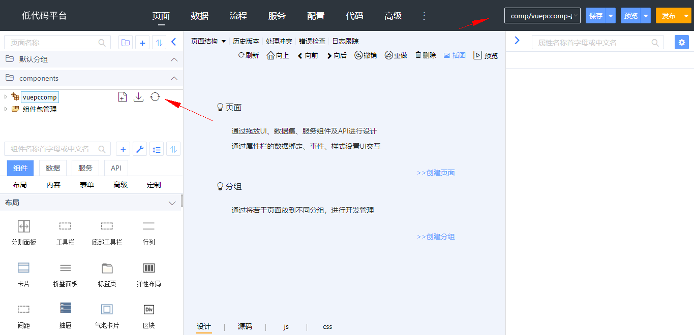
更新后,切换到桌面端或移动端,在组件面板的高级分类中会显示出该组件
在设计器中显示
在设计器 js 文件 (UI2/comp/vuepccomp/components/Uploads/designer/Uploads.js) ,引入样式文件,和设计时 js 文件。
require("css!./css/Uploads").load();
vuepccompBaseComponent.Uploads = require("vue!./Uploads.vue");
打开组件设计时 css 文件 (UI2/comp/vuepccomp/components/Uploads/designer/css/Uploads.css) ,设置上传组件中的上传区域在图片墙模式下的样式,定义样式如下。
.ant-upload-wrapper.ant-uploads .ant-upload-list .ant-upload-list-item.ant-upload-more-icon .ant-upload-list-item-actions .anticon {
    width: 16px;
    margin: 0 4px;
    font-size: 16px;
    cursor: pointer;
    transition: all .3s;
    color: black;
}

.ant-upload-wrapper.ant-uploads .ant-upload-list .ant-upload-list-item.ant-upload-more-icon:hover .ant-upload-list-item-actions .anticon {
    color: white;
}

.ant-upload-wrapper.ant-uploads .ant-upload-list .ant-upload-list-item.ant-upload-more-icon .ant-upload-list-item-actions {
    opacity: 0.5;
}

.ant-upload-wrapper.ant-uploads .ant-upload-list .ant-upload-list-item.ant-upload-more-icon:hover .ant-upload-list-item-actions {
    opacity: 1;
}

.ant-upload-wrapper.ant-uploads .ant-upload-list .ant-upload-list-item.ant-upload-more-icon {
    width: 100%;
    border: none;
}
设计时 js 文件,引入依赖的组件,完成组件设计时渲染。
<script lang="jsx">
let {commonProps, useRefData, useUse, useFireEvent, useData, omitProps} = window.vueContainer;
</script>
<script setup lang="jsx">
let {Button, Space} = antd;

let {DownloadOutlined, UploadOutlined} = window["antdv-icon"]
let {useAttrs, useSlots, reactive, watch} = Vue;

let props = defineProps({
  class: {type: String, default: ""},
  showBatchDownload: {
    type: Boolean, default: true
  },
  ...commonProps
})
let emits = defineEmits([]);
let fireEvent = useFireEvent(emits);
let attrs = useAttrs();
let slots = useSlots();

let use = useUse(props);
let refData = useRefData(props);


let UploadsProRender = () => {
  let {Upload} = antdvBaseComponent;
  let {...vSlots} = slots;
  let {showBatchDownload, class: className, ...others} = props;
  others.class = className + " ant-uploads ";
  let omittedProps = omitProps(others, commonProps);
  let uploadProps = use.getProps("Upload", "upload", {});
  if (showBatchDownload) {
    if (uploadProps.listType == "picture-card") {
      vSlots.default = () => <div disabled={props.disabled} class={"ant-upload-list-item ant-upload-more-icon"}>
        <div class={"ant-upload-list-item-actions"}>
          <Space>
            <UploadOutlined class={"ant-upload-flag"}/>
            <DownloadOutlined/>
          </Space>
        </div>
      </div>;
    } else {
      vSlots.default = () => <Space>
        <Button class={"ant-upload-flag"}><UploadOutlined/>上传</Button>
        <Button><DownloadOutlined/>打包下载</Button>
      </Space>;
    }
  }
  return <Upload listType="text"  {...attrs} {...uploadProps} {...omittedProps} vSlots={vSlots}></Upload>;
}
</script>

<template>
  <UploadsProRender >
    <slot/>
  </UploadsProRender>
</template>
配置组件属性
打开组件 meta 文件 UI2/comp/vuepccomp/components/Uploads/Uploads.meta.json,定义属性,如下所示
{
    "Uploads": {
        "properties": {
            "bind:ref": {
                "type": "dataRef",
                "label": "绑定数据列",
                "editor": "dataRef",
                "required": "true"
            },
            "showBatchDownload": {
                "label": "显示打包下载",
                "type": "boolean",
                "default-value": "true"
            }
        }
    }
}
- 在 properties 中定义属性
- 所有属性都需要定义
- 不显示的属性不定义 label
- bind:ref 绑定数据集的某个字段
配置引用
通过使用 ext:use 特性,引用平台封装的 Upload 组件提供的属性。来减少组件元信息文件中的冗余配置,以达到简便开发目的。
{
    "Uploads": {
        "uses": {
            "upload": {
                "key": "upload",
                "componentName": "antdv:Upload",
                "label": "上传配置",
                "editor-parameter": {
                    "ignore-properties": [
                        "bind:ref"
                    ]
                }
            }
        }
    }
}
在运行时显示
在组件运行时 js 文件 (UI2/comp/vuepccomp/components/Uploads/Uploads.vue) 中,导入平台封装的 Upload 组件,以及 vue_addon/core、Ant-design-vue 的 Space|Button|message 和样式文件。代码如下
<script setup lang="jsx">
import {commonProps, useRefData, useUse, useFireEvent, useData, omitProps} from "vue_addon/core";
import {DownloadOutlined, UploadOutlined} from '@ant-design/icons-vue';
import {useAttrs, useSlots, reactive, watch} from "vue";
import Upload from "../../../antdv/components/Upload/Upload.vue";
import {Button, Space, message} from "ant-design-vue";
</script>
<style src="./css/Uploads.css"></style>
vue_addon/core 文件中,封装了可获取操作数据的各种 Api。
详见《组件运行时 JS 文件》。
运行时样式文件,设置上传组件中的上传区域在图片墙模式下的样式。
.ant-upload-wrapper.ant-uploads .ant-upload-list .ant-upload-list-item.ant-upload-more-icon .ant-upload-list-item-actions .anticon {
    width: 16px;
    margin: 0 4px;
    font-size: 16px;
    cursor: pointer;
    transition: all .3s;
    color: black;
}

.ant-upload-wrapper.ant-uploads .ant-upload-list .ant-upload-list-item.ant-upload-more-icon:hover .ant-upload-list-item-actions .anticon {
    color: white;
}

.ant-upload-wrapper.ant-uploads .ant-upload-list .ant-upload-list-item.ant-upload-more-icon .ant-upload-list-item-actions {
    opacity: 0.5;
}

.ant-upload-wrapper.ant-uploads .ant-upload-list .ant-upload-list-item.ant-upload-more-icon:hover .ant-upload-list-item-actions {
    opacity: 1;
}

.ant-upload-wrapper.ant-uploads .ant-upload-list .ant-upload-list-item.ant-upload-more-icon {
    width: 100%;
    border: none;
}
- 定义 render 方法,使用 use.getProps 来获取 ext:use 中设置的属性。代码如下:
let UploadsProRender = () => {
  let {showBatchDownload, class: className, ...others} = props;
  others.class = className + " ant-uploads ";
  let {...vSlots} = slots;
  let uploadProps = use.getProps("Upload", "upload", {});
  if (showBatchDownload) {
    if (uploadProps.listType == "picture-card") {
      vSlots.default = () => <div disabled={props.disabled} class={"ant-upload-list-item ant-upload-more-icon"}
                                  onClick={handleClick}>
        <div class={"ant-upload-list-item-actions"}>
          <Space>
            <UploadOutlined class={"ant-upload-flag"}/>
            <DownloadOutlined onClick={handleDownload}/>
          </Space>
        </div>
      </div>;
    } else {
      vSlots.default = () => <Space onClick={handleClick} class={"ant-upload-more"}>
        <Button class={"ant-upload-flag"}><UploadOutlined/>上传</Button>
        <Button onClick={handleDownload}><DownloadOutlined/>打包下载</Button>
      </Space>;
    }
  }
  return <Upload listType="text"  {...attrs} {...uploadProps} {...others} vSlots={vSlots}></Upload>;
}
- 给“上传”按钮之外的 dom 设置阻止事件冒泡,来取消“打开文件选择对话框”行为
let handleClick = event => {
  let currentNode = event.currentTarget;
  let node = event.target;
  let getParentNode = (nodeName, node) => {
    while (node && node.nodeName.toLowerCase() != nodeName) {
      node = node.parentNode;
    }
    return node;
  }
  if (currentNode.classList.contains("ant-upload-more-icon")) {
    node = getParentNode("span", node);
  } else {
    node = getParentNode("button", node);
  }
  if (!node || (node && !node.classList.contains("ant-upload-flag"))) {
    event.stopPropagation()
  }
}
- 给“打包下载”按钮设置下载逻辑
let handleDownload = event => {
  let files = refData.getRefValue();
  if (!files) {
    message.error("请先上传附件");
    return;
  }
  let zipFileName = "多文件打包下载.zip";
  //调用storageapi前端自带接口实现打包下载
  fetch("/storage/batchStream?zipFileName=" + zipFileName, {
    headers: {'Content-Type': 'application/json'},
    method: 'POST', // 指定请求方法为POST
    body: files, // 将FormData对象作为请求体发送
    responseType: "blob"
  }).then(response => {
    if (!response.ok) {
      throw new Error('Network response was not ok');
    }
    return response.blob(); // 将响应转换为blob格式
  }).then(blob => {
    // 创建一个链接元素用于下载
    const url = window.URL.createObjectURL(blob);
    const a = document.createElement('a');
    a.style.display = 'none';
    a.href = url;
    a.download = zipFileName; // 指定下载文件的名称
    document.body.appendChild(a);
    a.click(); // 触发下载
    window.URL.revokeObjectURL(url); // 释放URL对象
    document.body.removeChild(a); // 移除链接元素
  }).catch(error => {
    console.error('There was a problem with the fetch operation:', error);
  });
}
调试组件
- 切换到桌面端或移动端
- 在页面上添加上传组件、选择数据、设置上传
- 保存、预览
发布组件
导出组件包
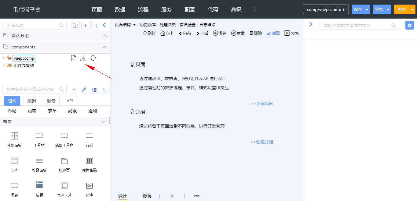
切换到 vuepccomp 开发端,点击 vuepccomp 组件包右侧的导出按钮,如下图所示,导出 vuepccomp.zip 文件。
上传市场并审核
进入控制台,打开“组件管理-组件发布”功能,点击“发布组件”按钮,输入组件包信息,上传组件包文件,点击“提交审核”按钮
控制台管理员 system 进入控制台,打开“组件管理-组件管理”功能,在“状态”选择器中选择“审核中”或“更新审核中”,显示出提交待审核的组件,点击“审核”按钮,再点击“通过”按钮
打开应用,添加市场组件,可以看到上传组件
至此,上传组件开发完毕。