开发 React Period 移动端时段组件
通过使用 Period 时段组件,实现选择时间范围效果,也可以使用时段组件的预设功能快速选择常用时间范围。

设计思路
使用平台基于 @antmjs/vantui Field 和 RadioGroup 组件进行二次封装的 Field 和 RadioGroup 组件,来实现 Period 时段组件核心逻辑,使用 @antmjs/vantui 的 CellGroup 、 Cell 、 Row 、 Col 来实现时段组件的布局逻辑,Css 控制 RadioGroup 默认样式。
使用方法如下
<RadioGroup value={"none"} direction="horizontal" optionsLabel="label"
            optionsValue="value"
            options={this.optionsData}
            onChange={this.handleGroupChange}>
</RadioGroup>
<Field type={"date"} refDataId={refDataId} inputAlign={"center"} clearTrigger={"focus"} refColumnName={beginRefColumnName} refRow={refRow} onChange={event => this.handleFieldChange(event, "begin")}>
</Field>
<span>-</span>
<Field type={"date"} refDataId={refDataId} inputAlign={"center"} clearTrigger={"focus"} refColumnName={endRefColumnName} refRow={refRow} onChange={event => this.handleFieldChange(event, "end")}>
</Field>
开发过程
新建组件
创建 reactmobilecomp 组件包,创建 Period 组件,注意大小写。创建组件功能参考《创建组件包和组件》。
配置组件名称、图标和模板
打开组件模板文件 UI2/comp/reactmobilecomp/components/Period/designer/Period.xml,如下所示
<element name="reactmobilecomp:Period"
             tag-name="Period"
             text="时段"
             icon="Period.png"
             discriminate-condition="executeXpath(name()='reactmobilecomp:Period')"
             component-type="layout-container"
             design-view="web-designer">
    <events>
        <include path="$UI/wxsys/comps/reactContainer/commonConfig.xml#//react-events-pcx/*"/>
    </events>
    <templates>
        <template name="default">
            <![CDATA[
                <reactmobilecomp:Period xmlns:reactmobilecomp="$UI/comp/reactmobilecomp/components" >
                </reactmobilecomp:Period>
            ]]></template>
    </templates>
</element>
- element 中的 text 是组件名称
- element 中的 icon 是组件图标
- 图片文件位于 UI2/comp/reactmobilecomp/components/Period/designer/img/Period.png
- include 引用标准 W3C 事件,非组件事件。
- template 中的代码是组件模板
- 在页面添加组件后,模板是加在 w 文件中的代码
在组件面板中显示
打开组件面板配置文件 UI2/comp/reactmobilecomp/components/reactmobilecomp.components.xml,如下所示
<reg-info>
    <!-- 组件目录注册 -->
    <component-dirs framework="react">Period</component-dirs>

    <!-- 组件工具箱配置 -->
    <toolbox>
    </toolbox>

    <!-- 兼容旧端工具箱配置 -->
    <quickide-toolbox>
    </quickide-toolbox>

    <!-- 傻瓜式ide工具栏配置 -->
    <uixide-toolbox framework="react">
        <catalog name="定制" order="13">
            <item component-name="reactmobilecomp:Period" device="mx"/>
        </catalog>
    </uixide-toolbox>

    <depend-css>
    </depend-css>
    <depend-js>
    </depend-js>
</reg-info>
- catalog 中的 name 是组件分类名称
- item 中的 device 属性声明组件所在端
- item 中的 module 属性一般组件不需要,删除即可
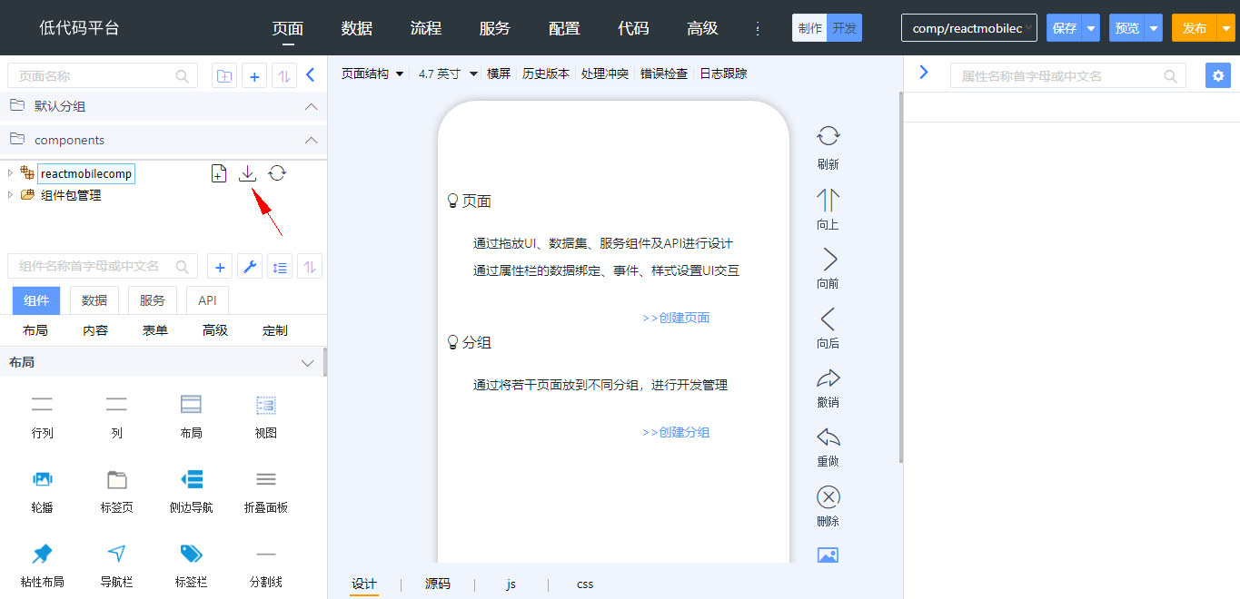
切换到 reactmobilecomp 开发端后,点击 reactmobilecomp 组件包右侧的“更新配置文件”按钮,如下图所示。

更新后,切换到桌面端或移动端,在组件面板的高级分类中会显示出该组件
在设计器中显示
在设计器 js 文件 (UI2/comp/reactmobilecomp/components/Period/designer/Period.js) ,引入样式文件,和设计时 js 文件。
require("css!./css/Period").load();
reactmobilecompBaseComponent.Period = require("babel!./Period.react");
打开组件设计时 css 文件 (UI2/comp/reactmobilecomp/components/Period/designer/css/Period.css) ,修改 @antmjs/vantui Radio 默认样式,只显示文字不显示图标,定义样式如下。
.van-period .van-radio-group.van-radio-group--horizontal {
    justify-content: center;
}

.van-period .van-radio-group.van-radio-group--horizontal .van-radio {
    flex: 1;
    justify-content: center;
}


.van-period .van-period-datetimebox {
    display: flex;
    align-items: center;
    justify-content: center;
}

.van-period .van-cell::after {
    border: none;
}
设计时 js 文件,引入依赖的组件,完成组件设计时渲染。
define(function (require) {
    let {Radio, RadioGroup, Row, Col, Field, Cell, CellGroup} = vantui;
    let BaseComponent = require('babel!$UI/wxsys/comps/reactContainer/designer/BaseComponent');

    class PeriodPro extends BaseComponent {
        constructor(props) {
            super(props);
            this.mockData = [
                {value: "today", label: "今日"},
                {value: "week", label: "本周"},
                {value: "month", label: "本月"},
                {value: "year", label: "本年"},
            ]
        }

        render() {
            let {
                onChange, className, preSetSpan = 24,
                preSetOffset,
                preSetGutter,
                span = 24, offset,
                gutter, ...other
            } = this.props;
            other.className = className + " van-period ";
            return <CellGroup {...other}>
                <Row>
                    <Col span={preSetSpan} offset={preSetOffset} gutter={preSetGutter}>
                        <Cell>
                            <RadioGroup value={"none"} direction="horizontal"
                            >
                                {
                                    this.mockData.map(item => <Radio renderIcon={<></>}
                                                                     value={item.value}>{item.label}</Radio>)
                                }
                            </RadioGroup>
                        </Cell>
                    </Col>
                    <Col span={span} offset={offset} gutter={gutter} className={"van-period-datetimebox"}>
                        <Field type={"date"} inputAlign={"center"}/>
                        <span>-</span>
                        <Field type={"date"} inputAlign={"center"}/>
                    </Col>
                </Row>
            </CellGroup>
        }
    }
    return PeriodPro;
})
配置组件属性
打开组件 meta 文件 UI2/comp/reactmobilecomp/components/Period/Period.meta.json,定义属性,如下所示
{
    "Period": {
        "properties": {
            "dateRangeRef": {
                "label": "日期区间",
                "editor": "refDataMultipleColEditor",
                "editor-parameter": {
                    "hideExprEditorTool": true,
                    "outputWsrcProps": [
                        {
                            "name": "refDataId",
                            "outName": "refDataId",
                            "label": "关联数据集id属性"
                        },
                        {
                            "name": "refRow",
                            "outName": "refRow",
                            "label": "关联数据集行属性"
                        },
                        {
                            "name": "refColumns",
                            "label": "关联数据集列属性",
                            "properties": {
                                "beginRefColumnName": {
                                    "label": "开始时间"
                                },
                                "endRefColumnName": {
                                    "label": "结束时间"
                                }
                            }
                        }
                    ]
                }
            },
            "preSetSpan": {
                "type": "number",
                "label": "预设区宽度"
            },
            "preSetOffset": {
                "type": "number",
                "label": "预设区偏移量"
            },
            "preSetGutter": {
                "type": "number",
                "label": "预设区间距"
            },
            "span": {
                "type": "number",
                "label": "日期范围宽度"
            },
            "offset": {
                "type": "number",
                "label": "日期范围偏移量"
            },
            "gutter": {
                "type": "number",
                "label": "日期范围间距"
            }
        }
    }
}
- 在 properties 中定义属性
- 所有属性都需要定义
- 不显示的属性不定义 label
- dateRangeRef 是个日期范围选择属性
- refDataMultipleColEditor 编辑器用来选择页面上的数据集组件,以及选择开始和结束两个字段,.w 中会生成 refDataId 、 beginRefColumnName 、endRefColumnName 、 refRow 4个属性。
配置组件事件
打开组件 meta 文件 UI2/comp/reactmobilecomp/components/Period/Period.meta.json,定义事件,如下所示
{
    "Period": {
        "events": {
            "onChange": {
                "label": "改变",
                "data": [
                    {
                        "label": "日期",
                        "name": "date"
                    },
                    {
                        "label": "日期字符串",
                        "name": "dateString"
                    }
                ]
            }
        }
    }
}
- 在 events 中定义事件
- events 中的节点是事件名称
- label 是事件中文名称
- data 是参数名称
在运行时显示
在组件运行时 js 文件 (UI2/comp/reactmobilecomp/components/Period/Period.react.js) 中,导入平台封装的 Field 和 RadioGroup 两个组件和 @antmjs/vantui 的 CellGroup 、 Cell 、 Row 、 Col 组件,以及 Reactmobilecomp 、 BaseComponent 和样式文件。代码如下
import React from 'react';
import {Cell, CellGroup, Row, Col} from "@antmjs/vantui";
import BaseComponent from 'components/mx/BaseComponent';
import RadioGroup from "../../../vantui/components/RadioGroup/RadioGroup.react";
import Field from "../../../vantui/components/Field/Field.react";
import "./css/Period.css";
import Reactmobilecomp  from "../reactmobilecomp/reactmobilecomp.js"
import moment from "moment";
- Reactmobilecomp 封装了 getTimeDistance Api 。从预设值转换成时间范围数组。
Reactmobilecomp.getTimeDistance=function(type) {
    const now = new Date();
    const oneDay = 1000 * 60 * 60 * 24;

    if (type === 'today') {
        now.setHours(0);
        now.setMinutes(0);
        now.setSeconds(0);
        return [moment(now), moment(now.getTime() + (oneDay - 1000))];
    }

    if (type === 'week') {
        let day = now.getDay();
        now.setHours(0);
        now.setMinutes(0);
        now.setSeconds(0);

        if (day === 0) {
            day = 6;
        } else {
            day -= 1;
        }

        const beginTime = now.getTime() - day * oneDay;

        return [moment(beginTime), moment(beginTime + (7 * oneDay - 1000))];
    }
    const year = now.getFullYear();

    if (type === 'month') {
        const month = now.getMonth();
        const nextDate = moment(now).add(1, 'months');
        const nextYear = nextDate.year();
        const nextMonth = nextDate.month();

        return [
            moment(`${year}-${fixedZero(month + 1)}-01 00:00:00`),
            moment(moment(`${nextYear}-${fixedZero(nextMonth + 1)}-01 00:00:00`).valueOf() - 1000),
        ];
    }

    return [moment(`${year}-01-01 00:00:00`), moment(`${year}-12-31 23:59:59`)];
}
BaseComponent 平台封装的基类。可获取操作数据的各种 Api。
详见《组件运行时 JS 文件》
运行时样式文件,覆盖 @antmjs/vantui RadioGroup 默认样式,只显示文字不显示图标。
.van-period .van-radio-group.van-radio-group--horizontal {
    justify-content: center;
}

.van-period .van-radio-group.van-radio-group--horizontal .van-radio {
    flex: 1;
    justify-content: center;
}

.van-period .van-radio-group.van-radio-group--horizontal .van-radio .van-icon {
    display: none;
}

.van-period .van-cell .van-cell__value .van-cell {
    padding: 0;
}

.van-period .van-period-datetimebox {
    display: flex;
    align-items: center;
    justify-content: center;
}

.van-period .van-radio-group--horizontal .x-radio {
    margin-left: inherit;
}

.van-period .van-cell::after {
    border: none;
}
- 定义 render 方法,代码如下:
let { onChange, refDataId, beginRefColumnName,endRefColumnName, refRow, className = "", preSetSpan = 24,    preSetOffset, preSetGutter, span = 24, offset, gutter, ...other} = this.props;
other.className = className + " van-period ";
return <CellGroup  {...other} >
    <Row>
        <Col span={preSetSpan} offset={preSetOffset} gutter={preSetGutter}>
            <Cell>
                <RadioGroup value={"none"} direction="horizontal" optionsLabel="label"
                            optionsValue="value"
                            options={this.optionsData}
                            onChange={this.handleGroupChange}>
                </RadioGroup>
            </Cell>
        </Col>
        <Col span={span} offset={offset} gutter={gutter} className={"van-period-datetimebox"}>
            <Field type={"date"} refDataId={refDataId} inputAlign={"center"} clearTrigger={"focus"}
                    refColumnName={beginRefColumnName} refRow={refRow}
                    onChange={event => this.handleFieldChange(event, "begin")}></Field>

            <span>-</span>
            <Field type={"date"} refDataId={refDataId} inputAlign={"center"} clearTrigger={"focus"}
                    refColumnName={endRefColumnName} refRow={refRow}
                    onChange={event => this.handleFieldChange(event, "end")}></Field>
        </Col>
    </Row>
</CellGroup>
- 接管 RadioGroup 组件 onChange 事件,把预设值转为时间数组,设置给数据集行对象 refRow 的 beginRefColumnName 和 endRefColumnName 属性上,通过 fireEvent 把事件抛给开发者。
handleGroupChange = (event) => {
    let value = event.detail
    let dates = Reactmobilecomp.getTimeDistance(value);
    let values = [];
    let valueStrs = []
    if (dates) {
        values[0] = dates[0]?.toDate?.();
        valueStrs[0] = dates[0].format('YYYY-MM-DD');
        values[1] = dates[1]?.toDate?.();
        valueStrs[1] = dates[1].format('YYYY-MM-DD');
    }
    this.fireEvent("onChange", [values, valueStrs], () => {
        this.getRefRow()[this.props.beginRefColumnName] = values[0]
        this.getRefRow()[this.props.endRefColumnName] = values[1]
    })
}
- 接管 Field 组件的 onChange 事件,把日期类型的值改为日期数组和日期字符串数组,通过 fireEvent 把事件抛给用户。
handleFieldChange = (event, type) => {
    let {detail: value} = event;
    if (value instanceof Date) {
        let values, valueStrs;
        if (type == "begin") {
            values = [value, this.getRefRow()[this.props.endRefColumnName]]
            valueStrs = [moment(value).format("YYYY-MM-DD"), moment(this.getRefRow()[this.props.endRefColumnName]).format("YYYY-MM-DD")]
        } else if (type == "end") {
            values = [this.getRefRow()[this.props.beginRefColumnName], value]
            valueStrs = [moment(this.getRefRow()[this.props.beginRefColumnName]).format("YYYY-MM-DD"), moment(value).format("YYYY-MM-DD")]
        }
        this.fireEvent("onChange", [values, valueStrs], () => {
        })
    }
}
调试组件
- 切换到桌面端或移动端
- 在页面上添加时段组件、选择数据、设置时段
- 保存、预览
发布组件
导出组件包
切换到 reactmobilecomp 开发端,点击 reactmobilecomp 组件包右侧的导出按钮,如下图所示,导出 reactmobilecomp.zip 文件
上传市场并审核
进入控制台,打开“组件管理-组件发布”功能,点击“发布组件”按钮,输入组件包信息,上传组件包文件,点击“提交审核”按钮
控制台管理员 system 进入控制台,打开“组件管理-组件管理”功能,在“状态”选择器中选择“审核中”或“更新审核中”,显示出提交待审核的组件,点击“审核”按钮,再点击“通过”按钮
打开应用,添加市场组件,可以看到时段组件
至此,时段组件开发完毕。