组件元信息
组件元信息是个 JSON 文件,在此文件中定义组件的属性、事件、工具栏、操作、引用等信息,大体结构如下所示
{
    "组件名": {
        "properties": {
            //属性
        },
        "events": {
            //事件
        },
        "toolbar": [{
            //工具栏
        }],
        "operations":[{
            //操作
        }],
        "uses": {
            // 引用
        }
    }
}
属性 properties
类型:JSON
在 properties 节点下定义组件属性,大体结构如下所示
{
    "组件名": {
        "properties": {
            "属性名":{
                "label": "",//属性中文名称
                "type": "",//属性类型
                "required":"",//属性是否必填,
                "default-value":"",//属性默认值
                "placeHolder":"",//属性占位符
                "editor":"",//属性编辑器
                "editor-parameter":"",//属性编辑器对应参数
                "visible-condition":"",//属性显示条件
                "enable-condition":"",//属性启用条件,
                "data":[],//当type=enum时,指定枚举值,
                "args":{},//java编译生成函数的参数
                "defaultContent":"",//节点默认内容
                "isStyle":false//是否写入组件的 style 属性
            }
        }
    }
}
数据绑定属性
平台内置几个数据绑定属性,分别是绑定数据集 bind:items、绑定数据列 bind:ref、绑定显示列 bind:labelRef、范围数据集 bind:options 等。
注意:绑定数据集 bind:items、绑定数据列 bind:ref、绑定显示列 bind:labelRef,这3个属性最终使用时数据集都会指向同一个,因此当bind:items与bind:ref属性同时存在且指向数据集不一致时,bind:ref会指向bind:item数据集,导致bind:ref获取到的数据存在异常。切忌bind:items与另外2个数据集混合使用。
- 绑定数据集 bind:items
表示该组件绑定一个数据组件,通过遍历数据,获取每行数据。例如:表格、列表等组件。以下是 bind:items 的属性定义
{
    "bind:items": {
        "type": "dataValue",
        "editor": "dataValueEditor",
        "label": "绑定数据集",
        "required": "true
    }
}
- 绑定数据列 bind:ref
表示该组件双向绑定到一个数据组件的某列,用于对这个列进行数据读写,通常用于表单输入类组件。例如:输入框、开关、选择器等组件,以下是 bind:ref 的属性定义
{
    "bind:ref": {
        "type": "dataRef",
        "label": "绑定数据列",
        "required": "true"
    }
}
- 绑定显示列 bind:labelRef
表示该组件双向绑定到一个数据组件的某列,用于对这个列进行数据读写。当组件既有 bind:labelRef 列,又有 bind:ref 列时,显示 bind:labelRef 的内容,否则显示 bind:ref 的内容。绑定显示列通常用于下拉选择组件。例如:选择器、树选择、级联选择组件,以下是 bind:labelRef 的属性定义
{
    "bind:labelRef": {
        "type": "dataRef",
        "label": "绑定显示列"
    }
}
- 范围数据集 bind:options
表示该组件的选项来源于一个数据集,例如:选择器、多选组、单选组等组件,以下是 bind:options 的属性定义
{
    "bind:options": {
        "type": "dataValue",
        "editor": "dataValueEditor",
        "label": "范围数据集",
        "required": "true"
    }
}
属性名 label
类型:string
显示在属性编辑器上的属性中文名。如不写,设计器上不显示该属性
属性类型 type
类型:string
属性类型包括:string、number、boolean、enum、style、src、Array、render|icon、object、json、function、ReactNode、VNode、dataValue、dataRef等。
字符串类型 string
用户可在设计器上输入或设置属性值。
数值类型 number
用户可在设计器上输入或设置属性值。
布尔类型 boolean
用户可在设计器上选择属性值。
枚举值 enum
在 data 中定义枚举值,用户可在设计器上选择枚举值。
例如:“下拉菜单”组件的“触发行为”属性,用户可以选择"点击"、"悬停"、"右键"等选项,代码如下
{
    "Dropdown": {
        "properties": {
            "trigger": {
                "type": "enum",
                "label": "触发行为",
                "data": [["click","点击"],["hover","悬停"],["contextMenu","右键"]],
                "default-value": "hover"
            }
        }
    }
}
对象类型 object
用户可在设计器上设置属性值,例如:
{{span:6,order:3}}
在组件元信息文件中,object 类型和 json 类型对等。
例如:“过滤条”组件的“提交按钮所在 col 的 props ”属性。
{
    "LightQuery":{
        "properties":{
            "submitterColSpanProps": {
                "type": "object",
                "label": "提交按钮所在 col 的 props"
            }
        }
    }
}
对象类型 json
同 object。
数组类型 Array
用户可在设计器上设置属性值。
例如:“评分”组件的“提示信息”属性,用户可设置["满意","不满意"]。
{
    "Rate": {
        "properties": {
            "tooltips": {
                "type": "Array",
                "label": "提示信息"
            }
        }
    }
}
图标类型 render|icon
用户可在设计器上输入或选择图标
例如:桌面端“按钮”组件的图标属性,指定 Antd 图标选择器,代码如下
{
    "Button": {
        "properties": {
            "icon": {
                "type": "render|icon",
                "editor": "antdproIconEditor",
                "label": "图标"
            }
        }
    }
}
例如:移动端“按钮”组件的图标属性,指定 Vant 图标选择器,代码如下
{
    "Button": {
        "properties": {
            "icon": {
                "editor": "vantuiIconEditor",
                "label": "图标"
            }
        }
    }
}
样式类型 style
如果 type 为 style 类型,平台运行时会生成 __styleToJSON 函数,把字符串生成标准的 JSON 对象。
例如:“卡片”组件的“内容样式”属性。
<Card bodyStyle={__styleToJSON('width:3px;height:3px;',this)} id="card0">
</Card>
资源类型 src
如果 type 为 src 类型,平台运行时会生成 wxPagePathResolver 函数,对路径进行特殊解析。
例如:“图片”组件的“地址”属性。
<Image id="image0" src={wxPagePathResolver('./images/cover.png',this)}>
</Image>
函数类型 function(参数列表):返回值
用户可在设计器上点击跳转生成函数定义和函数调用。
例如:“日期选择”组件的“不可选日期”属性,包括一个当前日期参数 currentDate,代码如下
{
    "DatePicker": {
        "properties": {
            "disabledDate": {
                "editor": "callFnEditorUix",
                "editor-parameter": {
                    "params": "currentDate"
                },
                "label": "不可选日期",
                "type": "function(currentDate):boolean",
                "args": {
                    "currentDate": {
                        "label": "当前日期"
                    }
                }
            }
        }
    }
}
React 节点 ReactNode
适用于 React 技术体系,定义一个 ReactNode 节点。
组件中包括 ReactNode 属性时,设计器工具栏上会显示“定制 XXX”和”删除 XXX“的按钮。点击“定制 XXX”按钮,W 页面中会生成“attr:属性名”节点,此时支持插入组件、写代码和定义表达式,如下图所示

如指定 defaultContent 属性,生成“ attr:属性名”节点时,会带有该属性指定的内容
例如:“回到顶部”组件的“文字描述”属性,包括节点默认内容,代码如下
{
    "BackTop": {
        "properties": {
            "description": {
                "type": "ReactNode",
                "label": "文字描述",
                "defaultContent": "<antdpro:Typography.Text xmlns:antdpro=\"$UI/comp/antdpro/components\" text=\"描述\"></antdpro:Typography.Text>"
            }
        }
    }
}
Vue 节点 VNode
适用于 Vue 技术体系,用法同上。
数据集类型 dataValue
绑定数据集属性使用 dataValue 类型,搭配 dataValueEditor 编辑器选择页面上的数据组件。
数据列类型 dataRef
绑定数据列属性使用 dataRef 类型,无需配置 editor 参数,系统自动使用 dataRef 编辑器,选择页面上数据组件的列。
必填 required
类型:string
定义属性是否必填,必填属性在设计器上显示为蓝色文字
默认值 default-value
类型:string
定义属性的默认值。
占位符 placeHolder
类型:string
定义属性没有设置时,显示的文字提示。
编辑器 editor
类型:string
定义属性设置时,使用的编辑器,编辑器的参数设置在 editor-parameter 属性中。常用编辑器如下:
- 代码编辑器 reactPropExpression | vuePropExpression
- 数据集选择器 dataValueEditor
- 数据集单列选择器 dataRef
- 数据集多列选择器 relationsDlg
- 页面选择编辑器 pageUrlEditor
- 页面参数编辑器 pageParamSelector
- 单选组编辑器 RadioGroupSetterEditor
- 函数生成编辑器 callFnEditorUix
- 图片选择编辑器 imgSelector
- 样式编辑器 stylePropEditor
- 颜色编辑器 colorEditorNew
- JSON 编辑器 JSONEditor
- 数组编辑器 ArrayEditor
- 行编辑器 rowEditor
- 范围选择编辑器 refDataMultipleColEditor
代码编辑器 reactPropExpression | vuePropExpression
React 体系的页面使用的代码编辑器是 reactPropExpression,Vue 体系的页面使用的代码编辑器是 vuePropExpression。平台默认会对 string、number、boolean、enum、object、json、Array、style、src、function 等类型的属性生成代码编辑器,用户显示指定无效。代码编辑器在设计器上用 “{/}” 表示,在代码编辑器中,编辑代码。代码编辑器生成的最终结果会带“ {} ”。
代码编辑器如下图所示
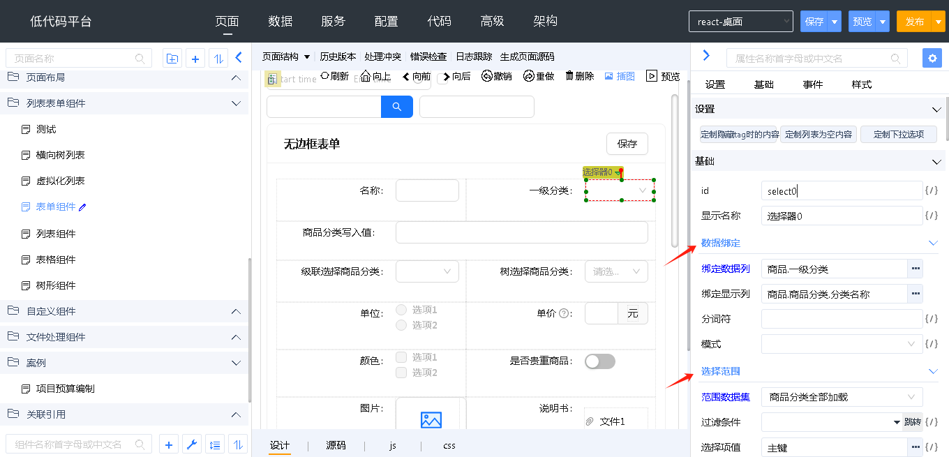
数据集选择器 dataValueEditor
列出页面上的数据组件,用于选择,如下图所示
例如:“列表”的“绑定数据集”属性,属性的 type 必须是 dataValue,代码如下
{
    "List": {
        "properties": {
            "bind:items": {
                "type": "dataValue",
                "editor": "dataValueEditor",
                "label": "绑定数据集",
                "required": "true
            }
        }
    }
}
数据集单列选择器 dataRef
用于选择页面上某个数据组件的某个字段,如下图所示
例如:“输入框”组件的“绑定数据列”属性。属性的 type 必须是 dateRef,此时可以省略 editor
{
    "Input": {
        "properties": {
            "bind:ref": {
                "editor": "dataRef",
                "type": "dataRef",
                "label": "绑定数据列",
                "required": "true"
            }
        }
    }
}
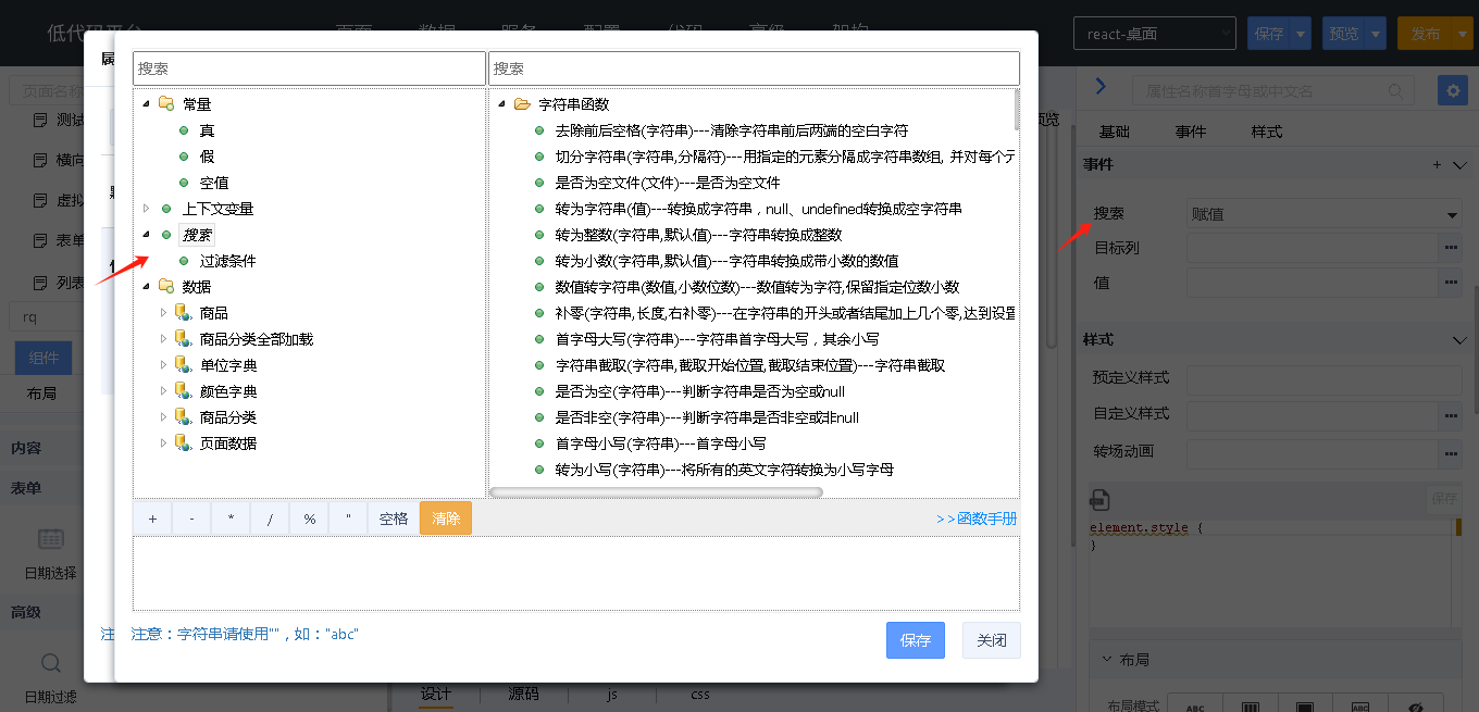
数据集多列选择器 relationsDlg
选择已选择数据集中的多个字段,数据集多列选择器提供一个参数用来设置已选择数据集的属性名,编辑器如下图所示
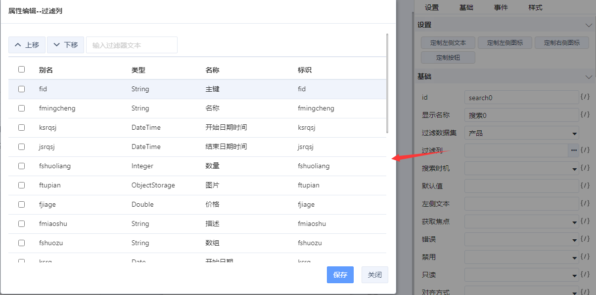
例如:“搜索”组件的“过滤列”属性,editor-parameter 属性中定义了已选择数据集的属性名 bind:items,代码如下
{
    "Search": {
        "properties": {
            "bind:items":{
                "type": "dataValue",
                "editor": "dataValueEditor",
                "label": "选择数据集"
            },
            "filterProps": {
                "type": "dataValue",
                "editor": "relationsDlg",
                "editor-parameter": "bind:items",
                "label": "过滤列"
            },
        }
    }
}
页面选择器 pageUrlEditor
页面选择器,用于选择一个页面,如下图所示
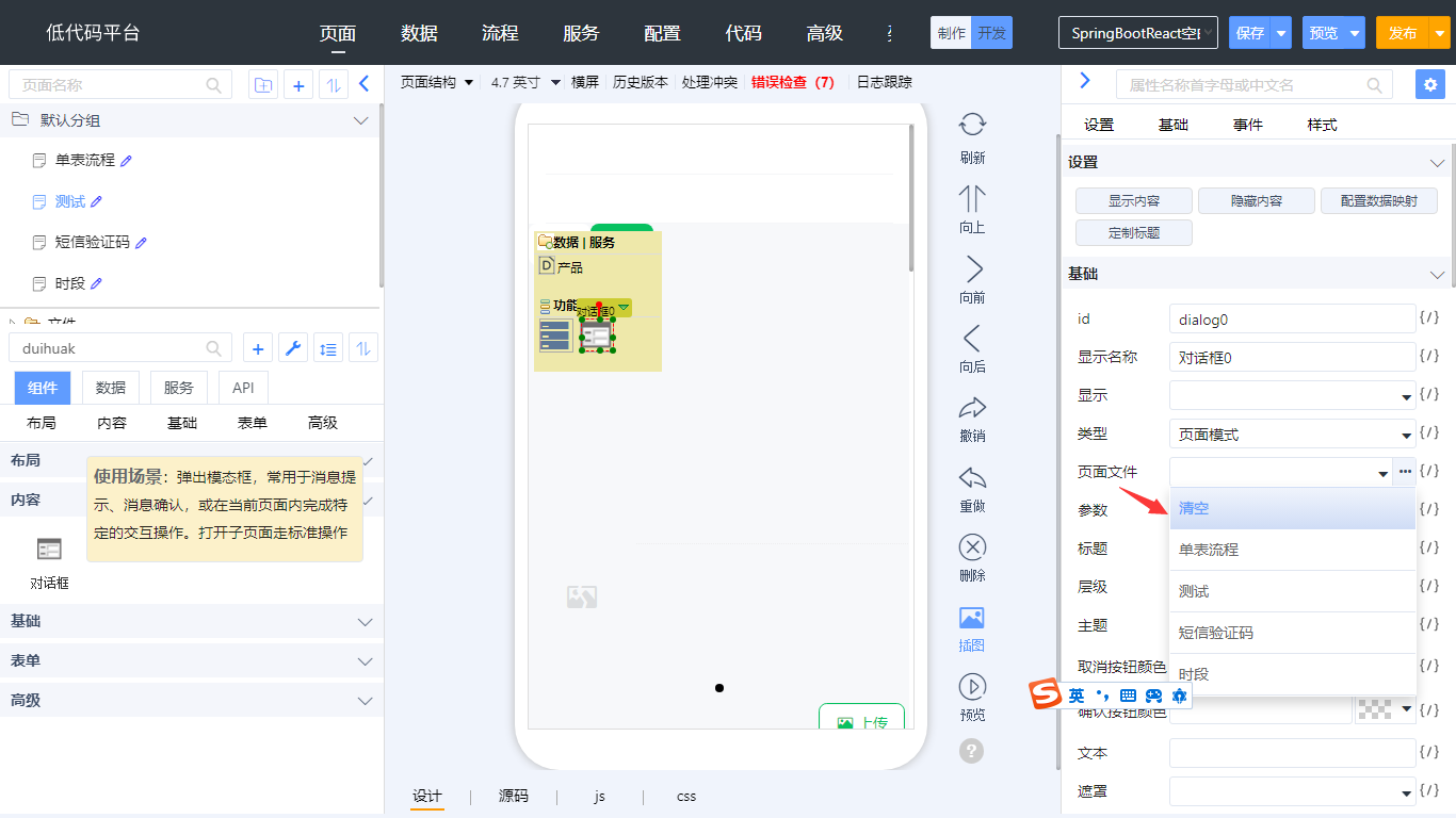
例如:“对话框”组件的“页面文件”属性,代码如下
{
    "Dialog": {
        "properties": {
            "pagePath": {
                "type": "string",
                "label": "页面文件",
                "editor": "pageUrlEditor"
            }
        }
    }
}
页面参数选择器 pageParamSelector
页面参数选择器,用于设置打开页面需要传递的参数,如下图所示
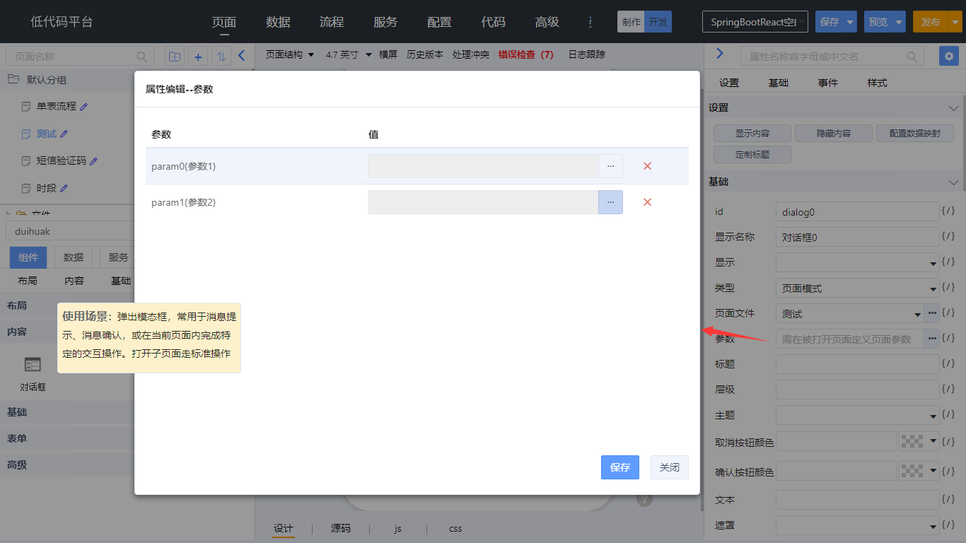
页面参数选择器提供2个参数:
- urlProp:设置页面文件属性的属性名
- retNoJsPrefix:页面参数编辑器回写不带“ js: ”
例如:“对话框”组件的“页面文件”和“页面参数”属性,editor-parameter 属性中定义了页面文件的属性名 pagePath,代码如下
{
    "Dialog": {
        "properties": {
            "pagePath": {
                "type": "string",
                "label": "页面文件",
                "editor": "pageUrlEditor"
            },
            "params": {
                "label": "页面参数",
                "type": "json",
                "editor": "pageParamSelector",
                "editor-parameter": "{'urlProp':'pagePath','retNoJsPrefix': true}",
                "placeHolder": "需在被打开页面定义页面参数"
            }
        }
    }
}
单选组编辑器 RadioGroupSetterEditor
单选按钮的属性编辑器,选项数据在 editor-parameter 中使用 data 属性来配置
例如:“表单”组件的“标签位置”属性。
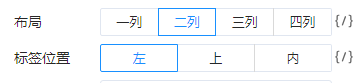
{
    "Form":{
        "properties":{
            "layout": {
                "editor":"RadioGroupSetterEditor",
                "label": "标签位置",
                "editor-parameter": {
                    "data": [
                        [
                            "horizontal",
                            "左"
                        ],
                        [
                            "vertical",
                            "上"
                        ],
                        [
                            "inline",
                            "内"
                        ]
                    ],
                    "default-value": "horizontal"
                }
            }
        }
    }
}
函数生成编辑器 callFnEditorUix
显示“跳转”按钮,用于在 JS 文件中生成函数定义,在 W 文件中生成函数调用,如下图所示
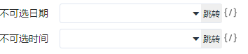
函数中的参数在 editor-parameter 和 args 属性中定义,注意格式不同。editor-parameter 中定义的参数配合 editor 使用,args中定义的参数配合表达式编辑器使用,如下图所示
例如:“日期选择”组件的“不可选日期”属性,定义了1个参数,代码如下
{
    "DatePicker": {
        "properties": {
            "disabledDate": {
                "editor": "callFnEditorUix",
                "editor-parameter": {
                    "params": "currentDate"
                },
                "label": "不可选日期",
                "type": "function(currentDate):boolean",
                "args": {
                    "currentDate": {
                        "label": "当前日期"
                    }
                }
            }
        }
    }
}
例如:“自动完成”组件的“根据输入项筛选”属性,定义了2个参数,参数之间使用逗号分隔,代码如下
{
    "AutoComplete": {
        "properties": {
            "filterOption": {
                "editor": "callFnEditorUix",
                "editor-parameter": {
                    "params": "inputValue,option"
                },
                "type": "function",
                "label": "根据输入项筛选",
                "args": {
                    "inputValue": {
                        "label": "输入值"
                    },
                    "option": {
                        "label": "选项"
                    }
                },
                "default-value": "true"
            }
        }
    }
}
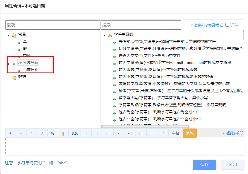
图片选择器 imgSelector
用于选择本地图片,如下图所示
例如:“图片”组件的“地址”属性,可选一个本地图片。
{
    "Image": {
        "properties": {
            "src": {
                "type": "src",
                "label": "地址",
                "editor": "imgSelector"
            }
        }
    }
}
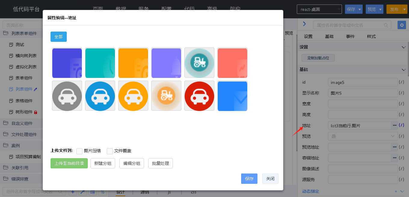
图标选择器 antdproIconEditor | vantuiIconEditor
用于选择图标,Antd 图标和 Vant 图标不同。
- Antd 图标选择器如下图所示

- Vant 图标选择器如下图所示
例如:桌面端“按钮”组件的图标属性,指定 Antd 图标选择器,代码如下
{
    "Button": {
        "properties": {
            "icon": {
                "type": "render|icon",
                "editor": "antdproIconEditor",
                "label": "图标"
            }
        }
    }
}
例如:移动端“按钮”组件的图标属性,指定 Vant 图标选择器,代码如下
{
    "Button": {
        "properties": {
            "icon": {
                "editor": "vantuiIconEditor",
                "label": "图标"
            }
        }
    }
}
样式编辑器 stylePropEditor
用于选择样式,如下图所示
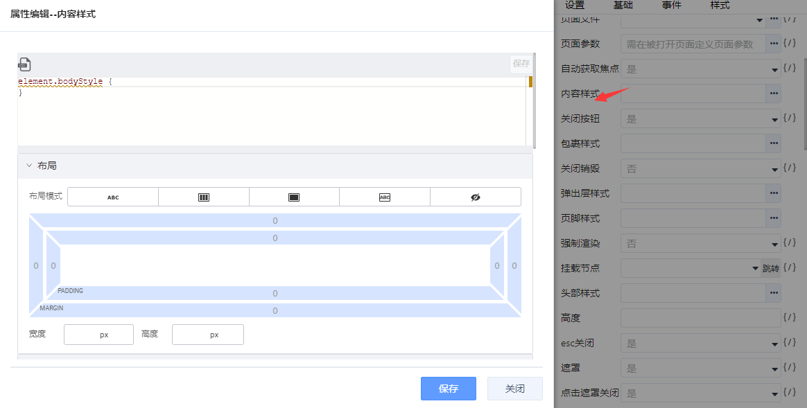
例如:“抽屉”组件的“内容样式”属性。
{
    "Drawer": {
        "properties": {
            "bodyStyle": {
                "type": "style",
                "label": "内容样式",
                "editor": "stylePropEditor"
            }
        }
    }
}
颜色编辑器 colorEditorNew
用于选择一个颜色,获取 hex 值,配合 isStyle 属性,决定该颜色是否写入到该组件的 style 属性中,如下图所示
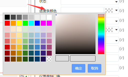
例如:“进度条”组件的“进度条颜色”属性,isStyle 属性设置为 false,表示不写入组件的 style 属性,代码如下
{
    "Progress": {
        "properties": {
            "strokeColor": {
                "type": "string",
                "label": "进度条颜色",
                "editor": "colorEditorNew",
                "isStyle": false
            }
        }
    }
}
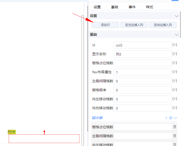
JSON 属性编辑器 JSONEditor
用于生成 JSON 对象的属性,如下图所示,“超小屏”下面的5个属性将以 JSON 对象的形式写入“超小屏”属性中
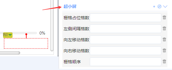
例如:“列”组件的“超小屏”属性,生成的属性为:
xs="{{"span":1,"offset":1,"pull":1,"push":2,"order":1}}"
属性定义代码如下
{
    "Col": {
        "properties": {
            "xs": {
                "label": "超小屏",
                "editor": "JSONEditor",
                "editor-parameter": {
                    "properties": {
                        "span": {
                            "label": "栅格占位格数",
                            "type": "number"
                        },
                        "offset": {
                            "label": "左侧间隔格数",
                            "type": "number"
                        },
                        "pull": {
                            "label": "向左移动格数",
                            "type": "number"
                        },
                        "push": {
                            "label": "向右移动格数",
                            "type": "number"
                        },
                        "order": {
                            "label": "栅格顺序",
                            "type": "number"
                        }
                    }
                },
                "type": "json"
            }
        }
    }
}
数组属性编辑器 ArrayEditor
用于生成 JSON Array 的属性,该编辑器只支持对象类型数组,不支持简单数据类型数组,如下图所示
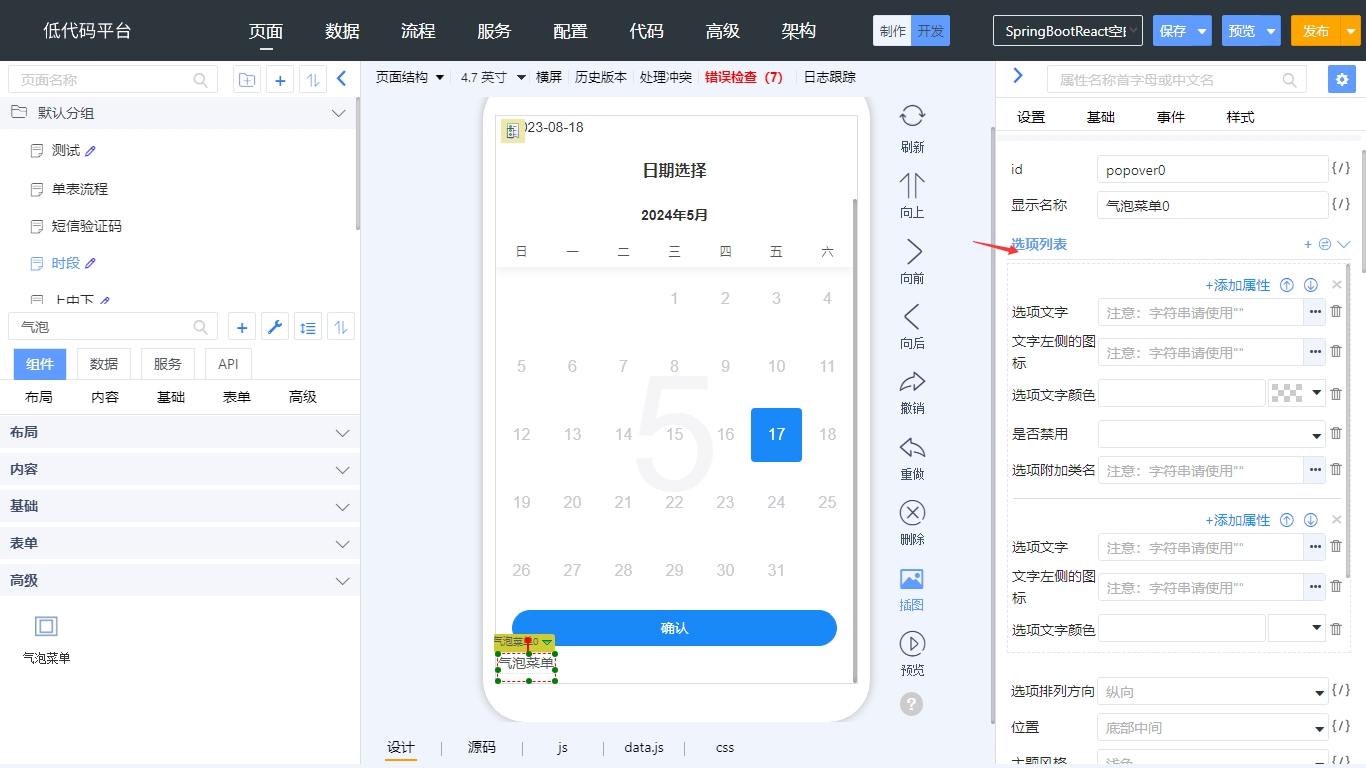
例如:“气泡菜单”组件的“选项列表”属性,生成的属性为:
actions=“[{"text":"菜单1","icon":"arrow-left","color":"#9FC5E8","disabled":false},{"text":"菜单2","icon":"circle","color":"#741B47"}]”
属性定义代码如下
{
    "Popover": {
        "properties": {
            "actions": {
                "label": "选项列表",
                "editor": "arrayEditor",
                "editor-parameter": {
                    "properties": {
                        "text": {
                            "type": "string",
                            "label": "选项文字"
                        },
                        "icon": {
                            "type": "string",
                            "label": "文字左侧的图标",
                            "editor": "vantIconEditor"
                        },
                        "color": {
                            "type": "string",
                            "label": "选项文字颜色",
                            "editor": "colorEditorNew",
                            "isStyle": false
                        },
                        "disabled": {
                            "type": "boolean",
                            "label": "是否禁用"
                        },
                        "className": {
                            "type": "string",
                            "label": "选项附加类名"
                        }
                    }
                },
                "type": "array"
            }
        }
    }
}
行编辑器 rowEditor
用于显示行和列、选择行和列及行列的方法,如下图所示
对于 type 属性为 function 的属性,将 args.record.editor 属性设置为 rowEditor,表达式编辑器中会显示出“行记录”,在 editor-parameter.dataPath 属性中设置数据集的属性名。例如:“选择器”组件的“过滤条件”属性,代码如下
{
    "Select": {
        "properties": {
            "optionsGroup": {
                "label": "选择范围",
                "properties": {
                    "bind:options": {
                        "type": "dataValue",
                        "editor": "dataValueEditor",
                        "label": "范围数据集",
                        "required": "true"
                    },
                    "optionsFilter": {
                        "editor": "callFnEditorUix",
                        "editor-parameter": {
                            "params": "record"
                        },
                        "type": "function",
                        "args": {
                            "record": {
                                "label": "行记录",
                                "editor": "rowEditor",//展开行记录
                                "editor-parameter": {
                                    "dataPath": "@bind:options"//指定某个数据集的行记录
                                }
                            }
                        },
                        "label": "过滤条件"
                    }
                }
            }
        }
    }
}
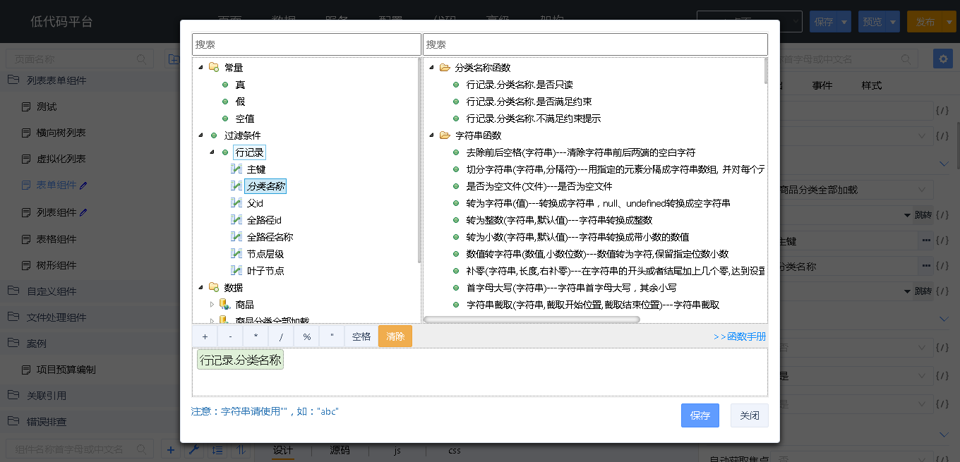
范围选择编辑器 refDataMultipleColEditor
用于选择时间范围的编辑器,如下图所示:
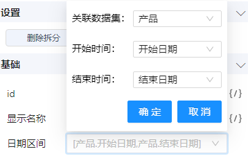
hideExprEditorTool:标识编辑器后面不显示表达式编辑器。outputWsrcProps:配置输出到.w中的内容,数组中的每一项,表示一个属性。outName 是生成在.w 中的属性名,name 表示编辑器读取的名称,refColumns 中properties 生成两个属性, beginRefColumnName 和 endRefColumnName。 例如:“日期范围选择”组件的“日期区间”属性,代码如下
{
    "DatePicker.RangePicker": {
        "properties": {
            "dateRangeRef": {
                "label": "日期区间",
                "editor": "refDataMultipleColEditor",
                "editor-parameter": {
                    "hideExprEditorTool": true,
                    "outputWsrcProps": [
                        {
                            "name": "refDataId",
                            "outName": "refDataId",
                            "label": "关联数据集id属性"
                        },
                        {
                            "name": "refRow",
                            "outName": "refRow",
                            "label": "关联数据集行属性"
                        },
                        {
                            "name": "refColumns",
                            "label": "关联数据集列属性",
                            "properties": {
                                "beginRefColumnName": {
                                    "label": "开始时间"
                                },
                                "endRefColumnName": {
                                    "label": "结束时间"
                                }
                            }
                        }
                    ]
                }
            }
        }
    }
}
编辑器参数 editor-parameter
配合 editor 属性使用,不同的 editor 参数不同,参考上面编辑器的说明
显示条件 visible-condition
类型:string
决定该属性是否在设计器上显示,可以指定 xpath 或 function,其中 function 需要在设计器 JS 文件中定义。
例如:“对话框”组件的“显示”属性,使用了 xpath,其中 @type 代表获取 type 属性的值,代码如下
{
    "Dialog": {
        "properties": {
            "type": {
                "type": "enum",
                "label": "类型",
                "data": [
                    [
                        "normal",
                        "常规模式"
                    ],
                    [
                        "frame",
                        "内嵌模式"
                    ],
                    [
                        "navigate",
                        "新页模式"
                    ]
                ],
                "default-value": "navigate"
            },
            "show": {
                "type": "boolean",
                "label": "显示",
                "default-value": "false",
                "visible-condition": "@type='frame' or @type='normal'"
            }
        }
    }
}
例如:“分割线”组件的“标题外边距”属性,使用了 funciton,代码如下
{
    "Divider": {
        "properties": {
            "orientationMargin": {
                "type": "number",
                "label": "标题外边距",
                "placeHolder": "方向 必须为 left 或 right",
                "visible-condition": "this.attrVisibleCondition"
            }
        }
    }
}
attrVisibleCondition 方法定义在 UI2/antdpro/components/Divider/designer/Divider.js 文件中,代码如下
define(function (require) {
    ...
    var Divider = AntdvComponent.extend({

        attrVisibleCondition: function (contextInfo) {
            let name = contextInfo.name;
            let method = contextInfo.method;
            var node = this.ownerDesigner.dataModel.getModelElement(this.$domNode.attr("d_id"));
            if (name == "orientationMargin") {
                let orientation = node.attr("orientation");
                return orientation == "left" || orientation == "right";
            }
            return false;
        }
    });
    ...
});
启用条件 enable-condition
类型:string
决定属性是否启用,用法同 visible-condition
例如:“间距”组件的“自动换行”属性,使用了 xpath,其中 @direction 代表获取 direction 属性的值,代码如下
{
    "Space":{
        properties:{
            "direction": {
                "type": "enum",
                "label": "间距方向",
                "data": [
                    [
                        "vertical",
                        "垂直"
                    ],
                    [
                        "horizontal",
                        "水平"
                    ]
                ],
                "default-value": "horizontal"
            },
            "wrap": {
                "type": "boolean",
                "label": "自动换行",
                "default-value": "自动换行",
                "enable-condition": "@direction='horizontal'"
            }
        }
    }
}
枚举值 data
类型:Array
属性类型 type 为枚举 enum 的时候,指定枚举值,格式为
[["属性值1","显示名称1"],["属性值2","显示名称2"]]
例如:
[["click","点击"],["hover","悬停"],["contextMenu","右键"]]
函数参数 args
args 用于描述函数参数信息,用于生成函数时生成参数(包括 java 编译)。其中的 label 属性,用于在表达式编辑器上显示参数,在自定义函数时选择它作为参数。
"args": {
    "currentDate": {
        "label": "当前日期"
    }
}
节点默认内容 defaultContent
对于节点属性,在 W 页面中生成“attr:属性名”节点时,同时生成的节点,定义在 defaultContent 属性中。例如:“回到顶部”组件的“文字描述”属性,定义节点默认内容如下
{
    "BackTop": {
        "properties": {
            "description": {
                "type": "ReactNode",
                "label": "文字描述",
                "defaultContent": "<antdpro:Typography.Text xmlns:antdpro=\"$UI/comp/antdpro/components\" text=\"描述\"></antdpro:Typography.Text>"
            }
        }
    }
}
属性分组
当组件的属性太多时,可以分组显示,如下图所示
例如:“选择器”组件的属性定义,代码如下
{
    "Select": {
        "properties": {
            "dataGroup": {
                "label": "数据绑定",
                "properties": {
                    "bind:ref": {
                    },
                    "bind:labelRef": {
                    },
                    "tokenSeparators": {
                    },
                    "mode": {
                    }
                }
            },
            "optionsGroup": {
                "label": "选择范围",
                "properties": {
                    "bind:options": {
                    },
                    "optionsFilter": {
                    },
                    "optionsValue": {
                    },
                    "optionsLabel": {
                    },
                    "optionsDisabled": {
                    }
                }
            },
            "searchGroup": {
                "label": "搜索",
                "properties": {
                    "showSearch": {
                    },
                    "allowClear": {
                    },
                    "autoClearSearchValue": {
                    }
                }
            },
            "defaultGroup": {
                "label": "默认",
                "properties": {
                    "autoFocus": {
                    },
                    "maxCount": {
                    },
                    "variant": {
                    },
                    "bordered": {
                    },
                    "clearIcon": {
                    },
                }
            },
            "maxTagPlaceholder": {
            },
            "notFoundContent": {
            },
            "optionRender": {
            }
        }
    }
}
事件 events
类型:JSON
在 events 节点下定义组件事件,大体结构如下所示
{
    "组件名": {
        "events": {
            "事件名":{
                "label": "",//事件中文名称
                "data": [{
                    "name":"",
                    "label":"",
                }],//事件参数列表
                "detail":{
                    "event.detail.属性":{
                        "label":"event.detail.属性中文名"
                    }
                },//event.detail.属性详情
                "cancelable":,//事件是否可以被阻止默认行为
            }
        }
    }
}
事件名 label
类型:string
显示在属性编辑器上的事件中文名。
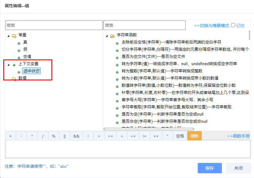
事件参数 data
类型:Array<{name,label}>
事件参数列表
- label 表示在表达式编辑器中显示的参数中文名
- name 表示参数名
在表达式编辑器中,显示事件参数,如下图所示
在 JS 文件中生成的方法中,包含事件参数,代码如下
onCheckCard0Change = ({checked}) => { }
例如:“多选卡片”组件中定义的“改变”事件,代码如下
{
    "CheckCard":{
        "events": {
            "onChange": {
                "label": "改变",
                "data": [
                    {
                        "label": "选中状态",
                        "name": "checked"
                    }
                ]
            }
        }
    }
}
事件详情信息 detail
类型:JSON<{label,editor}>
在 data 中定义 event 参数时,系统还支持在 event 参数中设置参数,参数定义在 detail 节点内。在生成函数的时候,系统会对 detail 中的内容自动进行对象解构处理。
在表达式编辑器中,显示 data 和 detail 中定义的参数,如下图所示
在 JS 文件中生成的方法中,包含 data 和 detail 中的参数,代码如下
onDateFilter0Search = (event) => {
    let {detail:{filter}} = event;
}
例如:“日期过滤”组件的“搜索”事件,在 data 中定义了 event 参数,在 detail 中定义了 filter 参数,代码如下
{
    "DateFilter": {
        "events": {
            "onSearch": {
                "data": [
                    {
                        "label": "事件",
                        "name": "event"
                    }
                ],
                "label": "搜索",
                "detail": {
                    "filter": {
                        "label": "过滤条件"
                    }
                }
            }
        }
    }
}
是否允许阻止默认行为 cancelable
类型:boolean
在派发组件事件时,可以设置组件事件完成后的默认行为,代码如下
- React 体系 *.react.js
this.fireEvent("事件名":string,事件对象:Event|Array,默认行为:Fn) - Vue 体系 *.vue
fireEvent("事件名":string,事件对象:Event|Array,默认行为:Fn)
cancelable 属性用于设置是否允许阻止默认行为
- 设置为 true:表示允许阻止默认行为,通过调用 event.preventDefault(); 阻止默认行为
- 设置为 false:表示不允许阻止默认行为
开发者可通过 event.cancelable 查看该事件是否允许阻止默认行为。
例如:“按钮”组件的“点击”事件,定义了 cancelable 属性为 true,表示允许阻止默认行为,代码如下
{
    "Button": {
        "events": {
            "onClick": {
                "label": "点击",
                "data": [
                    "event"
                ],
                "cancelable": true
            }
        }
    }
}
工具栏 toolbar
类型:Array<{text,method}>
在 toolbar 节点下定义组件设计器工具栏按钮,大体结构如下所示
{
    "组件名": {
        "toolbar": [{
            "text": "",//设计器上按钮的文本
            "method": "",//设计器上按钮调用的方法名, 需要在设计器模型 JS 中定义
        }]
    }
}
文本 text
类型:string
设计器上按钮文本,如下图所示
方法 method
类型:string
设计器上按钮调用的方法名, 需要在设计器模型 JS 中定义
工具栏案例
例如:“列”组件中定义的“添加行”工具栏,点击“添加行”调用 addRow 方法,代码如下
{
    "Col": {
        "toolbar": [
            {
                "text": "添加行",
                "method": "addRow"
            }
        ]
    }
}
addRow 方法定义在 UI2/antdpro/components/Col/designer/Col.js 文件中,代码如下
define(function (require) {
    ...
    var Col = AntdproComponent.extend({
        addRow: function () {
            ...
        }
    });
    ...
});
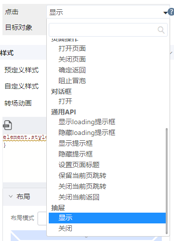
操作 operations
类型:Array<{label,items}>
在 operations 节点下定义组件操作,大体结构如下所示
{
    "组件名": {
        "operations": [{
            "label": "",//设计器上组件名
            "items": [{
                "name":"",//操作方法名, 需要在 React|Vue 中定义
                "label":"",//操作显示名,设计器中显示
            }],//操作项
        }]
    }
}
组件名 label
类型:string
设计器上操作列表中显示的组件名称,如下图所示
操作项 items
类型:Array<{name,label}>
定义组件操作的配置项,每个配置项包括操作方法名和显示名
方法名 name
类型:String
定义操作对应的方法名,在 .react.js 或 .vue 中定义。
标签名 label
类型:String
设计器上操作列表中组件下的操作名称,如下图所示
操作案例
例如:“抽屉”组件中定义的“显示”操作,执行显示操作会调用 show 方法,代码如下
{
    "Drawer": {
        "operations": [{
            "label": "抽屉",
            "items": [{
                "name": "show",
                "label": "显示"
            }]
        }]
    }
]
React 抽屉组件的 show 方法定义在 UI2/antdpro/components/Drawer/Drawer.react.js 文件中,代码如下
class DrawerPro extends BaseComponent {
    constructor(props, context) {
        super(props, context);
        this.state = {
            open: this.props.open,
            controllerType: "controlled"
        };
    }

    show = () => {
        this.setState({
            open: true,
            controllerType: "uncontrolled"
        })
    }
}
Vue 抽屉组件的 show 方法定义在 /tools/uix-web/vue_addon/core/use/useComp.js 文件中,代码如下
export function useVisible({state, props, propName = "visible"}) {
    let stateObj = {
        controlType: "controlled"
    }
    stateObj[propName] = false;
    state = state || reactive(stateObj);
    state.controlType = "controlled";

    watch(() => [props[propName], state.controlType], () => {
        if (state.controlType == "controlled") {
            return state[propName] = props[propName]
        }
    })
    let expose = {
        show: () => {
            state.controlType = "uncontrolled";
            state[propName] = true;
        },
        hide: () => {
            state[propName] = false;
        }
    }
    return [state, expose];
}
在 UI2/antdv/components/Drawer/Drawer.vue 中引用 useVisible,代码如下
import { commonProps, omitProps, useRefData, useUse, useFireEvent, usePage, useVisible } from "vue_addon/core";
let [state, exposeInfo] = useVisible({ props, propName: "open" });
引用 uses
类型:Object<{label,items}>
在 uses 节点下定义组件引用,大体结构如下所示
{
    "组件名": {
        "uses": {
            "label": "",//设计器上按钮标题
            "key": "",//key值,用于获取属性的键
            "componentName": "",//组件名
            "editor-parameter": {
                "ignore-properties": [
                    "",//属性不在设计器上显示
                ],
                "ignore-events": [
                    "",//事件不在设计器上显示
                ],
                "ignore-toolbar": [
                    "",//工具栏按钮不在设计器上显示
                ],
                "ignore-uses": [
                    "",//引用不在设计器上不显示
                ]
            }//配置忽略列表
        }
    }
}
标题 label
类型:string
工具栏按钮的标题,如下图所示
键 key
类型:string
用于组件代码获取对应属性的必要参数
组件名 componentName
类型:string
引用的组件名,需带命名空间,例如:antdpro:Tooltip
设计器参数 editor-parameter
类型:object
配置设计器显示引用组件时,不显示的属性、事件、工具栏按钮和引用
- ignore-properties:忽略引用组件的属性
- ignore-events:忽略引用组件的事件
- ignore-toolbar:忽略引用组件的工具栏按钮
- ignore-uses:忽略引用组件工具栏中引用的按钮
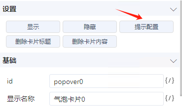
引用案例
当一个组件包括另一个组件的属性时,可以使用 uses 来引用组件,无需再定义属性,简化开发。
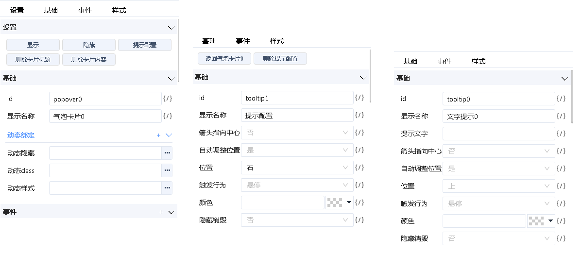
例如:“气泡卡片”组件的“提示配置”使用了“文字提示”组件的属性,代码如下
{
    "Popover": {
        "uses": {
            "tooltip": {
                "label": "提示配置",
                "key": "tooltip",
                "componentName": "antdpro:Tooltip",
                "editor-parameter": {
                    "ignore-properties": [
                        "title"
                    ],
                    "ignore-events": []
                }
            }
        }
    }
}
设计器界面如下图所示
- 左图为气泡卡片组件的属性
- 中图为气泡卡片组件引用文字提示组件,去掉 title 属性后显示的属性
- 右图为文字提示组件的属性
在组件运行时 JS 代码中,可以获取引用组件的属性
- React 体系 *.react.js
this.getUseProps("组件名", "key值")
- Vue 体系 *.vue
use.getProps("组件名", "key值")