门户定制案例-双层功能树
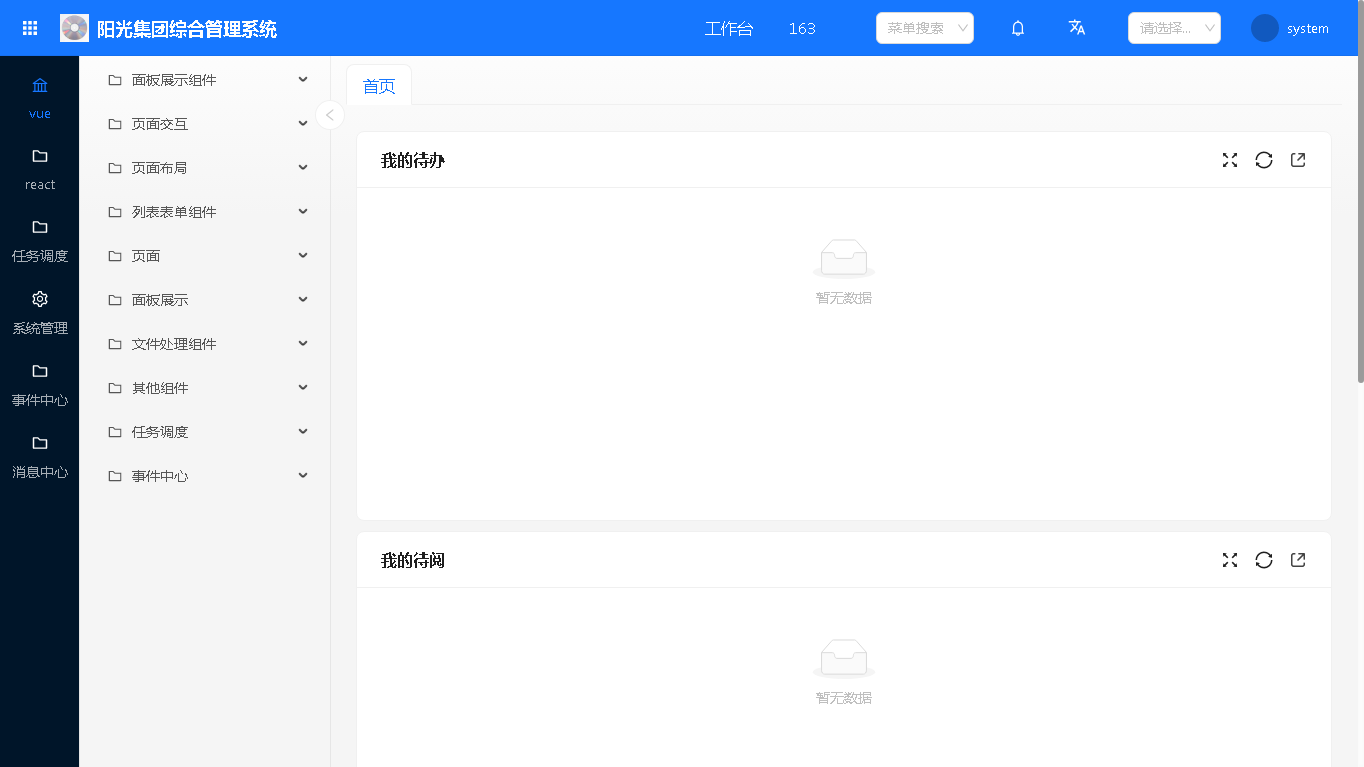
运行效果
定制门户页菜单为双层功能树
实现方法
- 定制企业门户应用,参考《门户定制》
- 在门户页 /entry/pcxapp/pcx/index.w 中,使用 @replace 重新定义菜单渲染方法 bindedMenuRender,左边用 a 显示一个个一级菜单,右边用 menus 组件显示一级菜单的子菜单
- bindedMenuRender 的参数 props.menus 是当前用户的完整菜单
添加扩展点
桌面端门户的扩展点方法写在 /UI2/comp/portalConfig/components/portalConfig/portalConfig.config.pc.js 文件的 onConfigContextInit 方法中,如果没有 portalConfig.config.pc.js 文件,将 portalConfig.config.js 文件复制为 portalConfig.config.pc.js 文件
添加门户页 /entry/pcxapp/pcx/index.w 渲染功能树方法 bindedMenuRender 的 replace 扩展点,代码如下
    async onConfigContextInit(configContextProcessor) {
        //获取当前页面
        let _this = configContextProcessor.page;
        let portalConfig = {
            "config": {
                "/entry": {
                    "/pcxapp": {
                        "/pcx": {
                            "/index.w": {
                                //菜单渲染方法执行后定制
                                "bindedMenuRender": {
                                    "@replace": (props, defaultDom) => {
                                    }
                                }
                            }
                        }
                    }
                }
            }
        };
        merge(_this.configContext, portalConfig);
        ConfigContextProcessor.enhancePageAdvice(_this);
    }
获取当前用户菜单
    "@replace": (props, defaultDom) => {
        let { menus } = props;
        ...
    }
完整代码
/UI2/comp/portalConfig/components/portalConfig/portalConfig.config.pc.js 文件的完整代码如下
import { merge } from "lodash";
import ConfigContextProcessor from 'core/framework/ConfigContextProcessor';
import React from 'react';
import Icon, { LeftOutlined ,RightOutlined } from '@ant-design/icons';
import { Menu } from 'antd';
import "./layout.css";

export default {

    processConfigContext(configContext) {
    },

    async onConfigContextInit(configContextProcessor) {
        //获取当前页面
        let _this = configContextProcessor.page;
        let portalConfig = {
            "config": {
                "/entry": {
                    "/pcxapp": {
                        "/pcx": {
                            "/index.w": {
                                //菜单渲染方法执行后定制
                                "bindedMenuRender": {
                                    "@replace": (props, defaultDom) => {
                                        let { menus } = props;
                                        let mainMenu = [];
                                        //一级菜单点击事件
                                        let onMainMenuClick=(e,item)=>{
                                            //删除选择calss
                                            document.querySelectorAll(".definedMenu-mainMenu").forEach(item=>{
                                                let classVal= item.getAttribute("class").replace("selected","");
                                                item.setAttribute("class",classVal);
                                            })
                                            //新增选择class
                                            let _a=e.currentTarget;
                                            let className=_a.getAttribute("class")+" selected";
                                            _a.setAttribute("class",className);
                                            //设置子菜单数据
                                            _this.setState({childItemMenus:item.children})
                                        }
                                        //获取一级菜单信息
                                        menus.forEach(item => {
                                            //默认展示第一个一级菜单下子菜单内容
                                            if(!_this.state.childItemMenus){
                                                _this.state.childItemMenus=item.children;
                                            }
                                            let menu =
                                                <a className={`definedMenu-mainMenu`} onClick={(e)=>{onMainMenuClick(e,item)}} title={item.title}>
                                                    <span className={"icon"}>{item.icon}</span>
                                                    <span className={"title"}>{item.title}</span>
                                                </a>
                                            mainMenu.push(menu);
                                        });
                                        //设置第一个菜单为选中
                                        let fitsrMenu=mainMenu?.[0];
                                        if(fitsrMenu){
                                            fitsrMenu.props.className+=" selected";
                                        }
                                        //转化数据为menu需要的数据格式
                                        let changeMenuData=(menuData)=>{
                                            menuData.map(item=>{
                                                item.label=item.title;
                                                //控制菜单是否显示
                                                if(item.hidden!="all"){
                                                    delete item.hidden;
                                                }
                                            });
                                            menuData.forEach(item=>{
                                                if(item.children){
                                                    changeMenuData(item.children);
                                                }
                                            })
                                        }
                                        //转换数据为menu组件支持的数据格式
                                        changeMenuData(_this.state.childItemMenus);
                                        //过滤无效的菜单
                                        _this.state.childItemMenus=_this.state.childItemMenus.filter(item=>item.hidden!="all");
                                        //二级菜单点击事件
                                        let onChildMenuClick=({ item:{props}})=>{
                                            //调用原菜单单击事件
                                            _this.menuItemClick(props);
                                        }
                                        //控制子菜单展开与隐藏
                                        const onClickOpenChildrenMenu=()=>{
                                            let {hideChildrenMenu=true}=_this.state;
                                            _this.setState({hideChildrenMenu:!hideChildrenMenu});
                                        }
                                        const showChildMenu=_this.state.hideChildrenMenu!==false;

                                        //建议在元素上新增key属性,用于判断当前元素是否已存在,需注意key的唯一性
                                        let hasChildren=_this.state.childItemMenus?.length>0;
                                        let defineMenu =
                                            <div className={`definedMenu ${hasChildren ? "normal" : "noChildren"} ${showChildMenu?"":"hideChildMenu"}`}>
                                                <div className={"definedMenu-icon"} onClick={onClickOpenChildrenMenu}>
                                                    <Icon component={showChildMenu?LeftOutlined:RightOutlined} />
                                                </div>
                                                <div className={"definedMenu-menuBox"}>
                                                    <div className={"definedMenu-mainMenuBox"}>{mainMenu}</div>
                                                    {hasChildren&&showChildMenu && (<>
                                                        <div className={"definedMenu-subMenuBox"}>
                                                            <Menu items={_this.state.childItemMenus} mode="inline" onClick={onChildMenuClick} style={{ width: 250 }} />
                                                        </div>
                                                    </>)}
                                                </div>
                                            </div>;
                                        return defineMenu;
                                    }
                                }
                            }
                        }
                    }
                }
            }
        };
        merge(_this.configContext, portalConfig);
        ConfigContextProcessor.enhancePageAdvice(_this);
    }
}
对应的layout.css样式请参考如下代码
.definedMenu {
    flex: 0 0 330px;
    position: relative;
}

.definedMenu.hideChildMenu{
    flex: 0 0 80px;
}

.definedMenu.noChildren{
    flex: 0 0 75px;
}
.definedMenu.noChildren .definedMenu-icon{
    display: none;
}
.definedMenu-icon{
    position: absolute;
    top:100px;
    right:-15px;
    width: 30px;
    height: 30px;
    overflow: hidden;
    border:1px solid rgba(5, 5, 5, 0.06);
    border-radius: 20px;
    background-color: #fff;
    z-index: 1;
    display: flex;
    align-items: center;
    justify-content: center;
    cursor: pointer;
    color:#ccc;
}
.definedMenu-icon:hover{
    color:#333;
}

.definedMenu * {
    box-sizing: border-box;
}

.definedMenu [hidden] {
    display: none;
}

.definedMenu-mainMenu {
    display: flex;
    align-items: center;
    flex-direction: column;
    margin: 5px;
    padding: 5px 0px;
    color: #ffffffa6;
}

.definedMenu-mainMenu:hover {
    color: #fff;
}

.definedMenu-mainMenu .icon {
    padding: 8px 0px;
    font-size: 16px;
    width: 16px;
    color: #fff;
    fill: #ffffffa6;
    stroke: #ffffffa6;
}

.definedMenu-mainMenu.selected {
    border-radius: 5px;
    color: var(--ant-color-primary);
}

.definedMenu-mainMenu.selected .icon{
    color: var(--ant-color-primary);
    fill: var(--ant-color-primary);
    stroke: var(--ant-color-primary);
}

.definedMenu-mainMenu .title {
    text-overflow: ellipsis;
    white-space: nowrap;
    overflow: hidden;
    width: 100%;
    text-align: center;
    padding: 0px 3px;
}

.definedMenu-menuBox {
    position: fixed;
    inset-block-start: 56px;
    display: flex;
    height: calc(100% - 56px);
}

.definedMenu-mainMenuBox {
    width: 80px;
    height: 100%;
    border-right: 1px solid #e5e5e5;
    background-color: #001529;
    overflow-y: auto;
}

.definedMenu-subMenuBox {
    flex: 1;
    height: 100%;
    border-inline-end: 1px solid rgba(5, 5, 5, 0.06);
    overflow: auto;
    position: relative;
}

.definedMenu-subMenuBox .iconAction {
    position: absolute;
    font-size: 22px;
    z-index: 100;
    right: -11px;
    top: 13px;
    cursor: pointer;
}